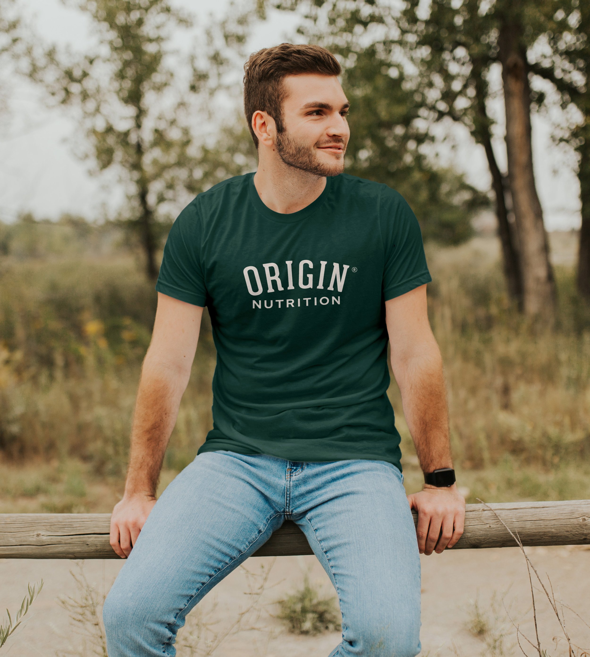
ORIGIN® CREAMERY
As the saying goes, cheese sells itself. (Or does it?…). ORIGIN® Creamery makes fantastic products that are as delicious as they are environmentally responsible.
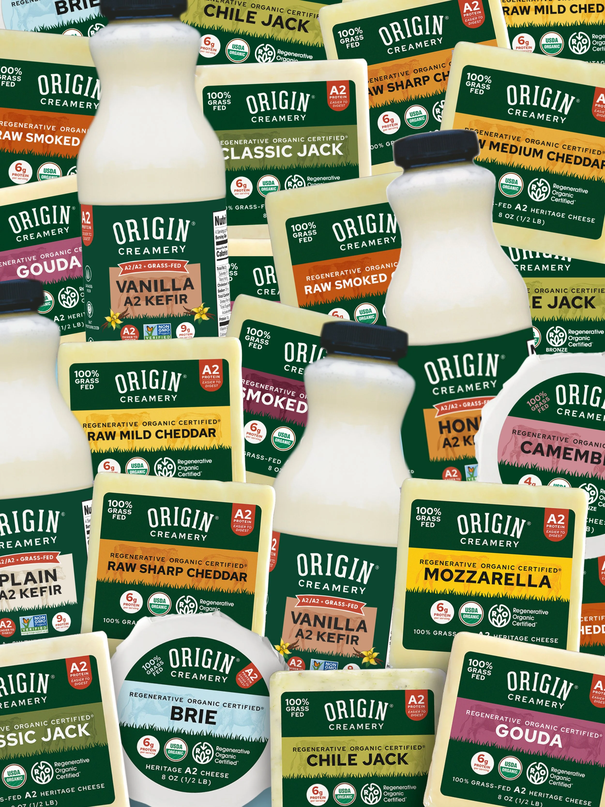
But their all-black packaging didn’t do much to differentiate one SKU from another, and their key selling points were fading into the background.
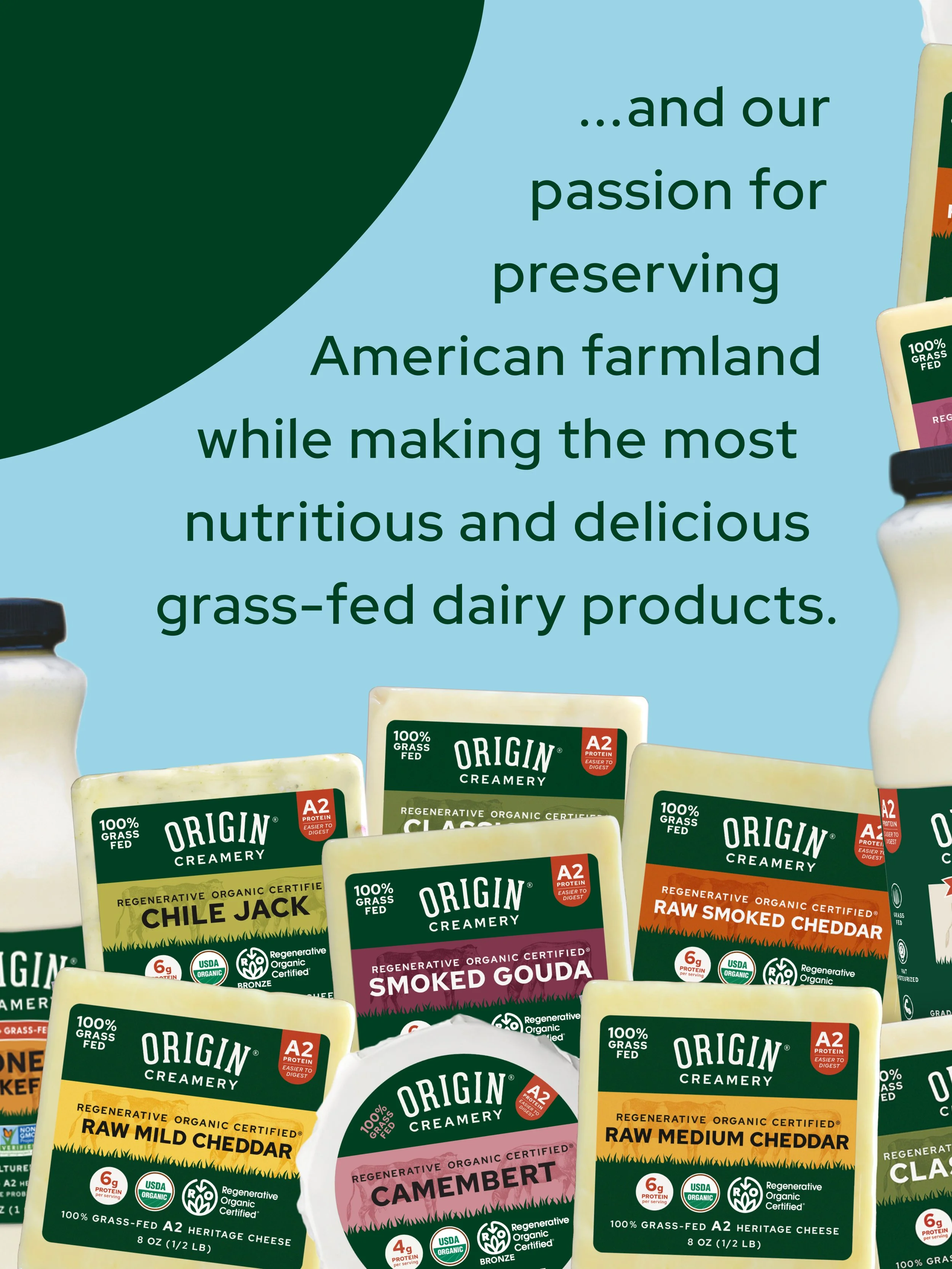
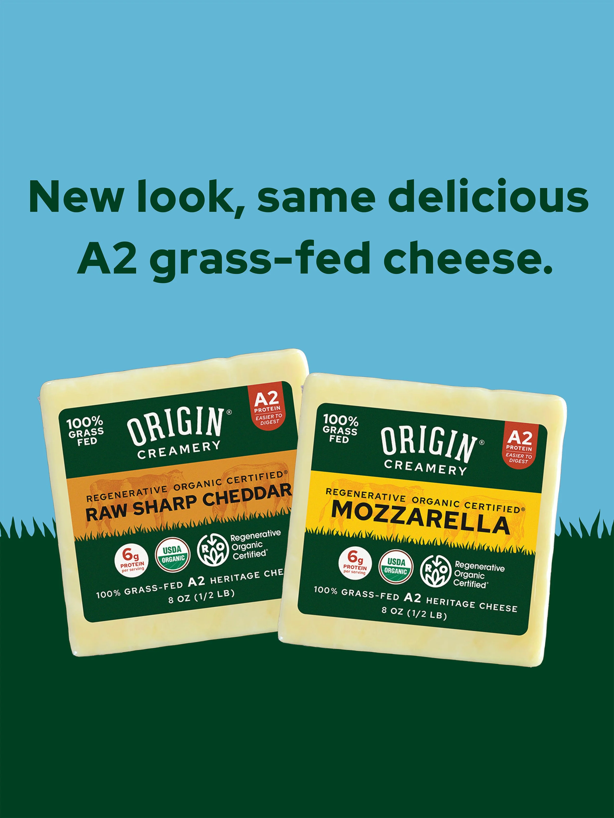
An extensive color system overhaul & thoughtful graphics improved storytelling on pack — delighting buyers and shoppers alike.

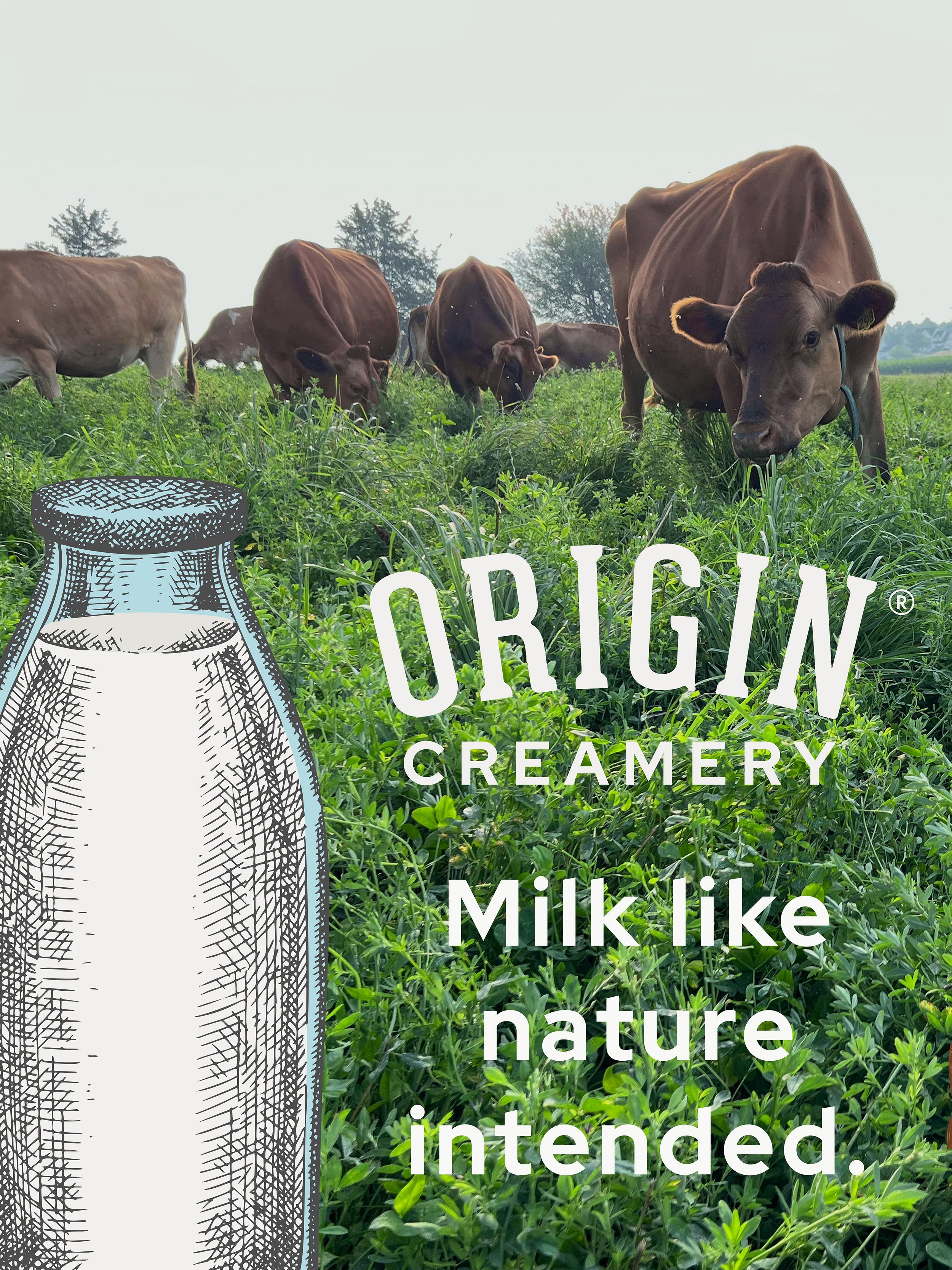
Telling a grass-fed story


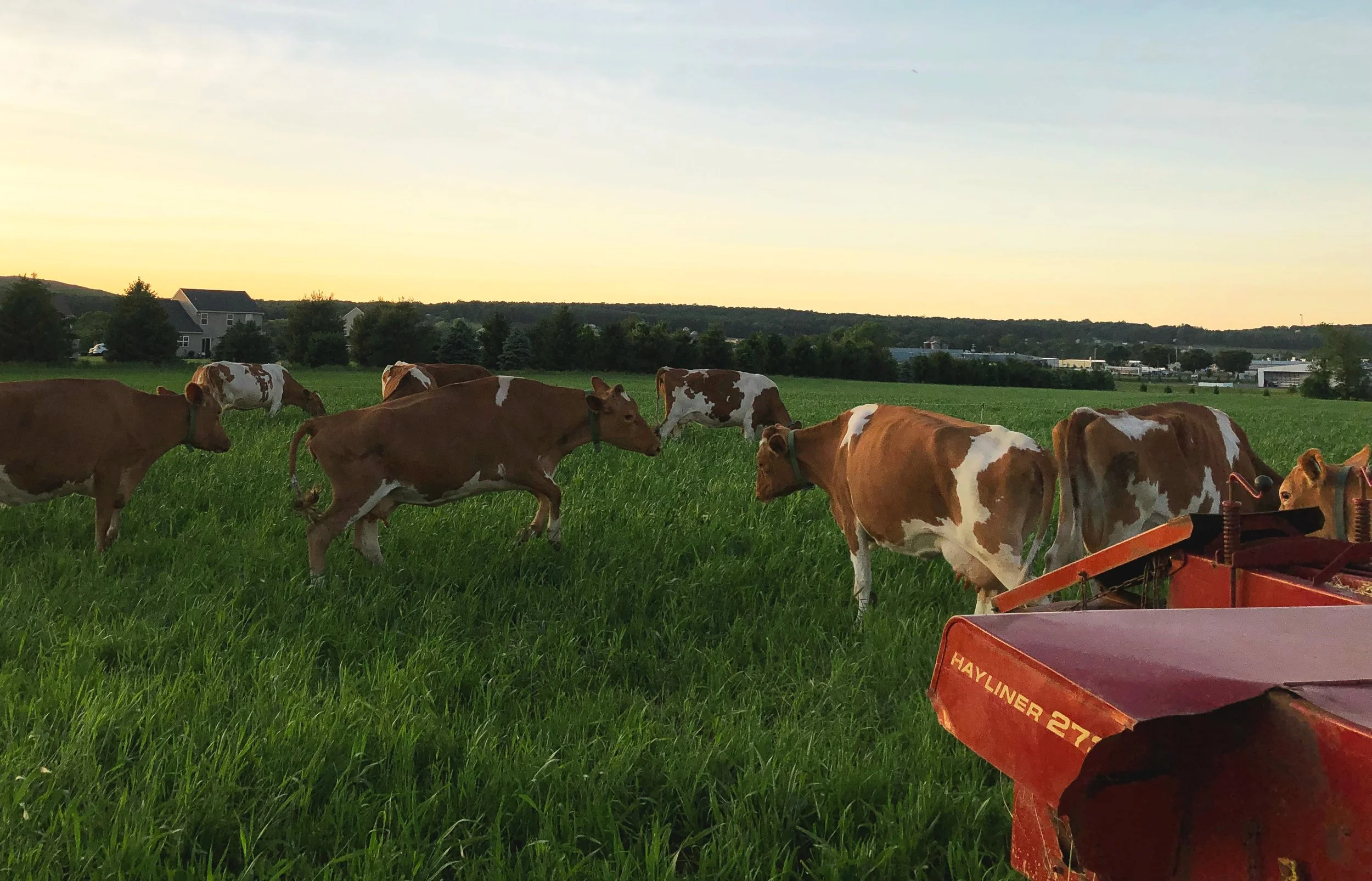


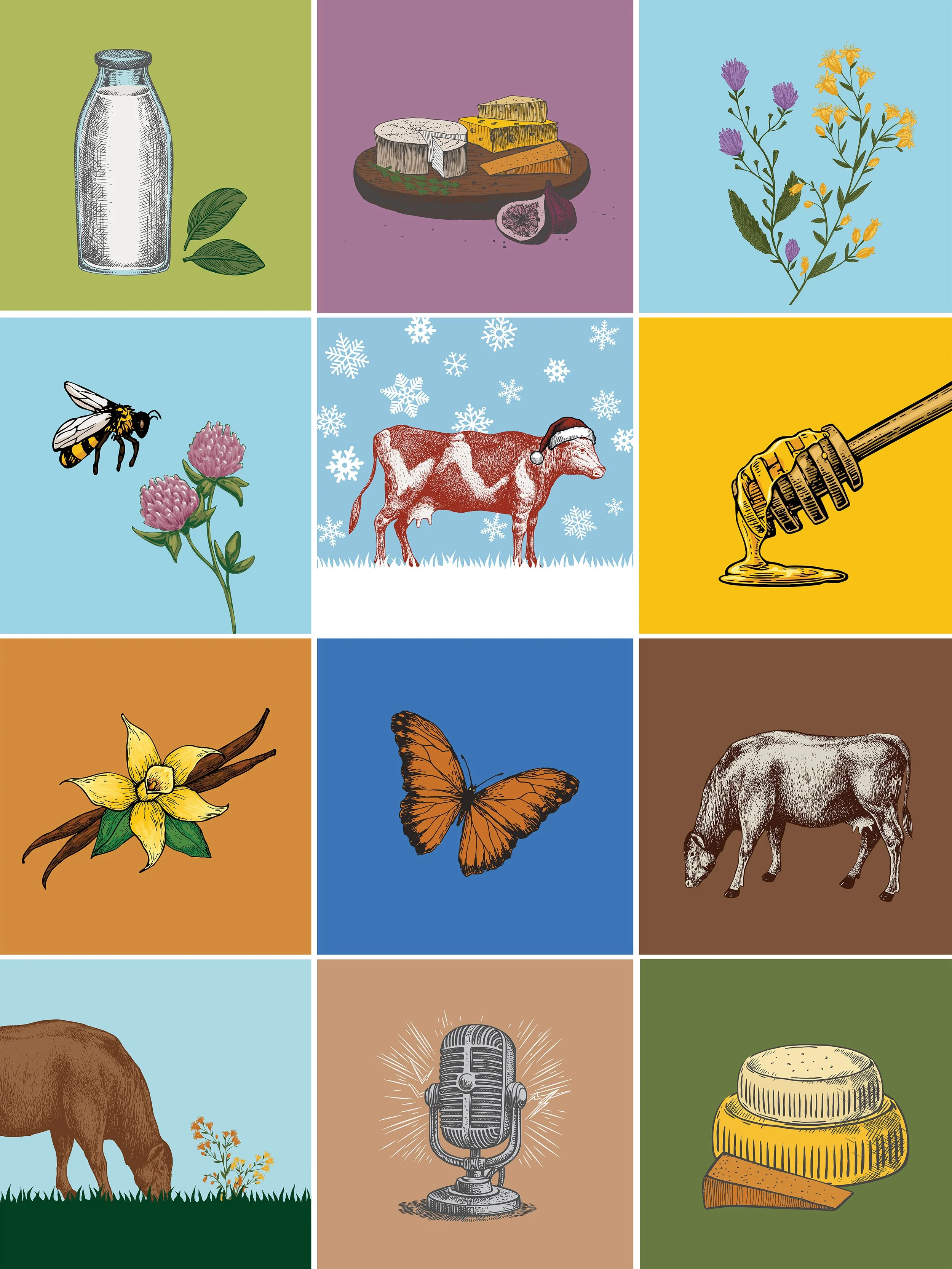
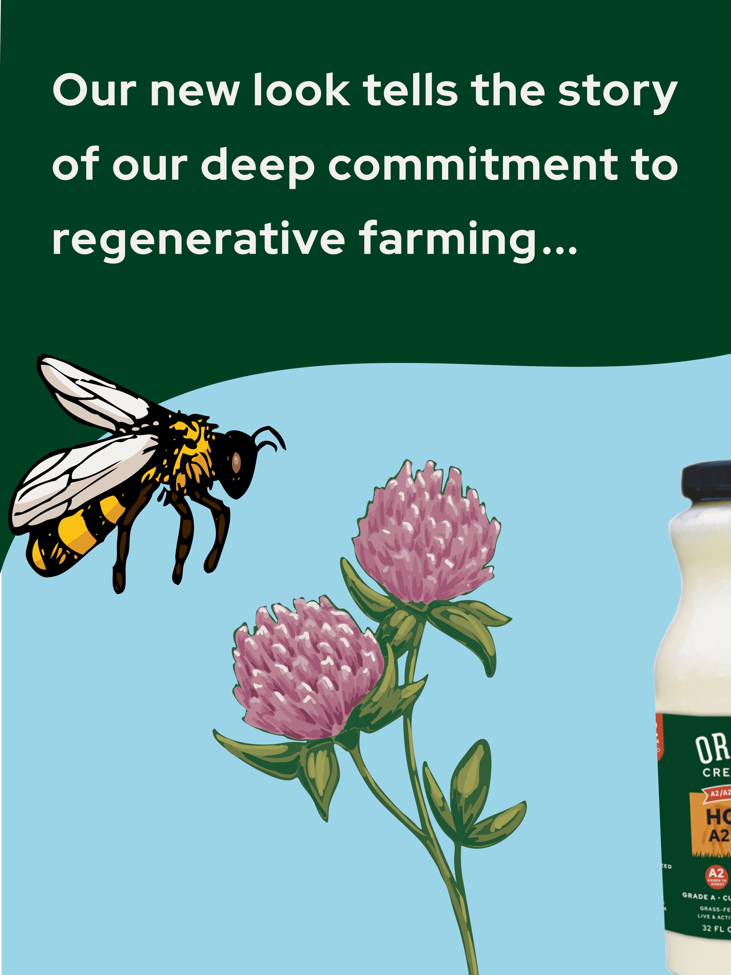
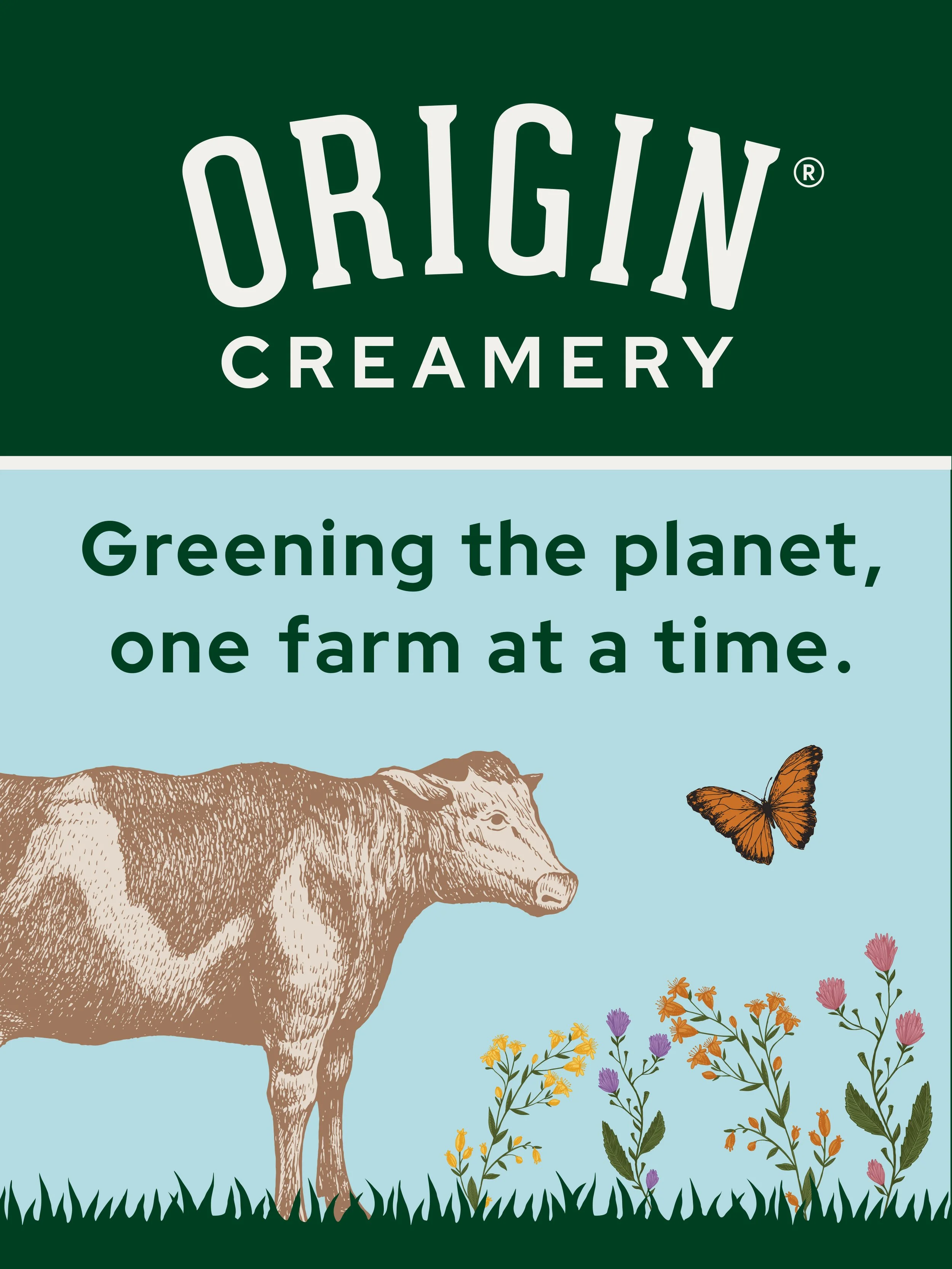
A nature-inspired color palette tells the regenerative organic ORIGIN sourcing story. Rich natural hues were chosen to pair with a new dark green — a brand color that brings an abundant pasture to shoppers’ minds.
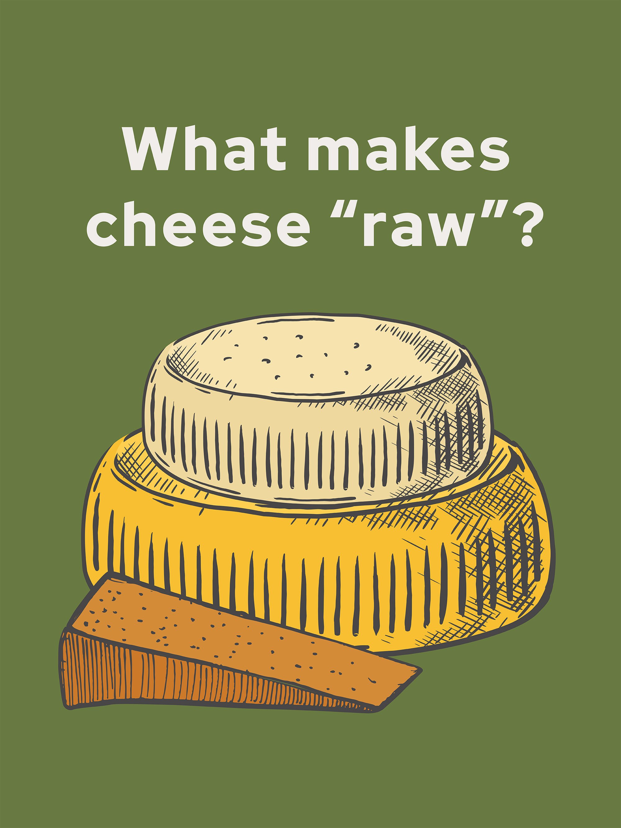
Elevated vector graphics depicting a grassy field with vintage-inspired cow etchings combines the ORIGIN milk ethos that we should be eating as our ancestors used to — as close to “right from the cow” as possible, and raised the right way.
STORYTELLING WITH COLOR


VISUALS THAT SELL
When it came time to launch the redesign online & in stores, we supported ORIGIN® by creating an effective series of visuals. These could be used as social content, as well as repurposed for other materials — sales presentations, assets for printed materials, as icons on the updated website, and beyond.